When a growing product needs a design system (and how to start one)
UX
When a growing product needs a design system (and how to start one)
Signs your website or SaaS needs a design system, what it should contain (tokens, components, patterns, documentation), how to build one without stopping product work, and how to keep it alive.
In short
Signs your website or SaaS needs a design system, what it should contain (tokens, components, patterns, documentation), how to build one without stopping product work, and how to keep it alive.
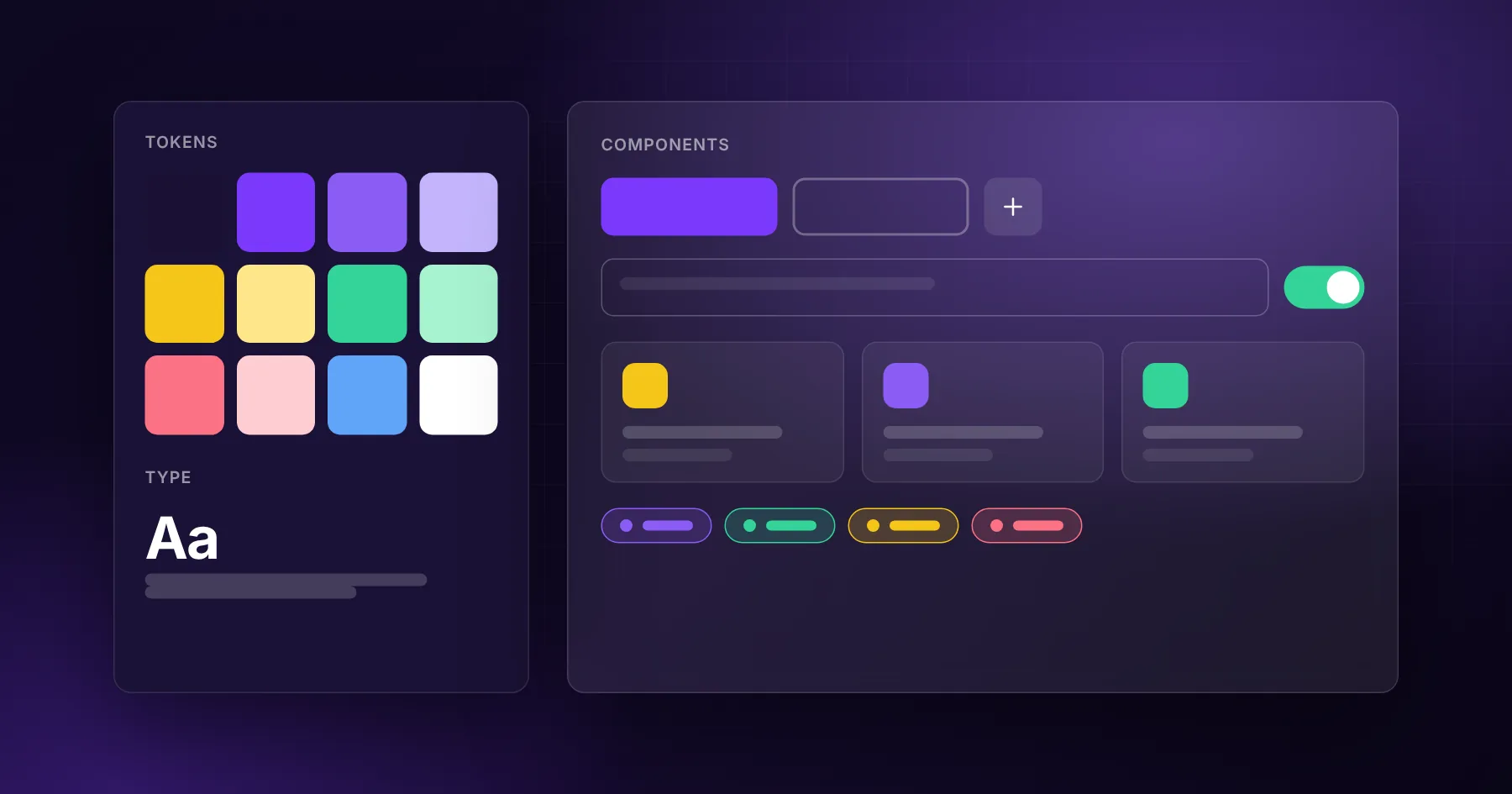
A product needs a design system when the same interface decisions are being made again and again: new screens look slightly different from old ones, developers rebuild buttons and forms for every feature, and design reviews spend time on spacing instead of user problems. A design system fixes this with shared tokens (colours, type, spacing), a library of coded components, patterns for common situations, and short documentation that tells people when to use what.
You do not need a design system for a five-page website. You probably need one when a product has dozens of screens, more than one person designing or building it, or several products that should look like one brand.
Signs it is time
Three different blue buttons exist, and nobody knows which one is right
Every new feature starts with "how should the table look this time?"
Developers copy components between files and change them slightly
Dark mode, a new brand colour or accessibility fixes would mean editing hundreds of places
Design handoff takes longer than building
Users notice that parts of the product feel like different apps
What a design system contains
Layer
What it is
Example
Tokens
Named values for design decisions
color.primary, space.4, radius.md, font.heading
Components
Coded, reusable building blocks
Button, input, select, modal, table, card, toast
Patterns
Combinations for common tasks
Forms with validation, empty states, filters, onboarding
Guidelines
When and how to use them
"Use one primary button per screen"
Tooling
Where it lives
Figma library, code package, documentation site
Tokens are the foundation. When colours and spacing are tokens, changing the brand colour or adding dark mode becomes a change in one file, not a hunt through the whole codebase.
Start from what already exists
Do not design a system from scratch on a blank canvas. Start with an inventory:
Screenshot every screen and group similar elements: all buttons, all inputs, all tables.
Count the variations. You will often find many shades of grey and several button styles.
Pick the best version of each element and define it as the standard.
Turn values into tokens: colours, font sizes, spacing, radii, shadows.
Build the most used components first, usually buttons, inputs, selects, cards, modals and tables.
This way the system reflects the real product, and the team recognises it.
Use a good base instead of reinventing everything
Modern component libraries give you accessible, well-tested foundations. For React products we often build on shadcn/ui and Tailwind CSS: the components live in your own code, so you can adapt them to your brand, and tokens map naturally to CSS variables. That is how we approach dashboards and SaaS interfaces such as our internal tools.
Whatever the base, make sure components handle keyboard use, focus states, screen readers and contrast from day one. Accessibility is far cheaper inside the system than fixed screen by screen later.
Build it without stopping product work
A design system project that freezes feature work for months rarely survives. Instead:
Build components when features need them. The next feature that needs a table builds the system table.
Replace old components gradually, page by page, during normal work.
Set a rule: new screens use system components; exceptions need a reason.
Assign an owner, even part-time, who reviews additions and keeps the documentation current.
Documentation people actually read
Keep documentation short and close to the code:
A live preview of each component with its variants
Do and don't examples
Copy-paste code snippets
Notes on accessibility and content (button labels, error messages)
A Storybook or a simple internal page is enough. Long PDFs are not read.
How to know it is working
New screens are designed and built faster
Fewer design review comments about spacing and colour
Fewer UI bugs reported
Brand or theme changes take hours, not weeks
New team members ship consistent screens in their first week
Design system for websites vs. products
A marketing website benefits from a lighter system: a type scale, colours, spacing, section layouts and a handful of components (hero, feature block, testimonial, call to action, form). A SaaS product needs more: data tables, forms, navigation, feedback states and complex patterns. Many companies share tokens between the two so the brand feels consistent from the landing page to the app.
For a simple website, a style guide is enough. For a product with many screens or several people working on it, even a small system of tokens and core components saves time quickly.
Is a Figma library a design system?
It is one part. A full design system also has coded components, so what designers draw is what developers ship.
How long does it take to build a design system?
A useful first version, with tokens and the ten most used components, can be ready in a few weeks. It then grows with the product.
Can we use an existing library like Material or shadcn/ui?
Yes. Starting from a solid library and adapting it to your brand is usually faster and more accessible than building every component from zero.